
Each of our rooms holds a strong but subdue hue. The colors were picked for their combination of boldness but subtleness. I know that's a contradiction but it's true. I love Apple Green and I wanted a green kitchen. The problem with Apple Green though is that is can get kind of loud. We instead "dulled" it and chose a more Avocado green. It's perfect. I love colors muted with gray/brown undertones.
Over the past few years we've tackled almost every room in the house. There are only three rooms left to be decorated. (Of course that doesn't mean I will be done .. it just means they will be "complete" for the first time ..) The three rooms left are: the office, the future nursery/spare room, and the master bath.
the master bath
This room has actually been painted already. About a year ago Mark and I tackled our foyer/mini-hallway and decided to keep it light and airy. We have cathedral ceilings, light carpet and lots of windows in the main part of the house but the foyer is different. It has a standard ceiling and dark wood floors. To keep it open, we reversed our general design cues and went with a light buttery yellow. It's fun and bright and helps break everything up. Since we had leftover paint, we used it to paint the guest bath off the hallway and the master bath. We've lived with it for a year now and, although I still love it in the front of the house, I'm just not feeling it in the master bath.
Time to start over. (yay!!!) We decided to get rid of our shower curtain, rugs, etc and completely start from scratch. I decided to switch back to what I love .. darker walls and lighter everything else. The bathroom floor is beige-y white and I found a beautiful shower curtain I love in a tan/taupe color. Since it's connected to our bedroom (which is a gray blue color) I knew I wanted it to coordinate. We have a 5-foot wide canvas hanging in our bedroom of the Brooklyn Bridge and NYC skyline. The picture was my inspiration for my bedroom and thus should carry over into the bathroom. I noticed a lot of purples in the sky and decided that was the avenue we should go down.

I can totally see how next to Purple Rain, Chambourd practically looks brown.

It's not. I promise.
I just can't decide if I want to go purple purple or hint of purple. I want it to be sophisticated because we could very much so get into teenage girl territory and that.is.not.ok.
When coupled with pretty whites, tans, and stainless fixtures.. this could work. So which one should I pick?
the nursery and office
I've coupled these two rooms together because we are going to paint them the same color; part for convenience and part for continuity since their doorways are right next to each other and thus part of the same visual field. In this instance, I am calling the spare room the nursery because that is how we want to think of it for this application. Painting is not our favorite thing. We don't want to have to do this again.
The office is totally hodge podge right now. It's a bunch of mix-matched pieces with no consistency. You've got to start somewhere and I've chosen paint. Since the office can go in any direction, I've decided to let just follow suit to the other room... and true to form, I have already planned the nursery. (of course I have, right?!)
As far as nurseries go, I am a more gender-neutral-anti-"baby-room" kinda gal. I love baby blues and soft pinks in other people's homes but in mine it would stick out like a sore thumb. I want the room to be something I would want to hang out in and something that can grow with my kid. That's why, no matter the gender, I have chosen gray walls. (*gasp*) I know it's very non-baby and some people think WAY too dark but I promise, if you saw the whole plan, it makes perfect sense.
Speaking of "the whole plan" .. I will not be revealing my nursery ideas until there is an actual baby. So it will be a while. Just saying ...
In order to help you pick colors, I have to give you a little hint of what I am thinking for in there. Since it really does matter the gender (even though it is mostly gender neutral) .. think jewel tones. Think apple green, bright blues and bright corals. See why I am going with gray?

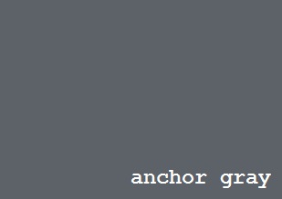
Anchor Gray has a blue undertone that makes we waver but Mark likes it the best. Stormy Sky is a more "true gray" as far as my eye is concerned but does it have enough personality? Burnt Ember is the warmest but maybe it's a little too brown? Who would have thought picking a gray would be so hard?!

So there you go. Three grays. Three different directions. We have a large Impressionist-style landscape that hangs in our office. I have confirmed that all three of these colors would coordinate nicely so there would be no need for new artwork .. unless, of course, I just want to ;)
So there's my color conundrum. Which purple and which gray should we choose? Any other hues I might have overlooked? Are we just simply crazy? Leave a comment and cast your vote!

My picks are Chambourd and Burnt Ember. you may think it's too brownish, but I promise you'll like it. We picked a more blueish gray for a lot of our house and I wish I would have gone more towards the brownish side (and i'm not a tan/brown type girl). Also, I love the gray for a nursery.....not that I'm biased or anything....
ReplyDelete